Tiếp tục với series, bài thứ 2: Bar chart for multiple response questions.
Target result
www.datavisualisation-r.com/pdf/barcharts_multiple.pdf
The study has been conducted since the early 1980s and is repeated every 9 years. Aside from a series of questions concerning value orientation, socio-economic data are also collected. On the topic of “It is often said that attitudes towards gender roles are changing”, the respondents were presented with a series of statements. They could respond to each statement with “Agree strongly”, “Agree”, “Disagree”, “Disagree strongly” and “Don’t know”. The look of the figure almost matches the previous example. However, there are a few differences.
- The first difference lies in the data: while before the diagram was defined by the individual attributes of a variable, here several variables are combined: each bar shows a variable’s value. Such a group of questions on one topic usually means longer labels for the bars, since one wants to show individual statements.
- The message of the thematic cluster acts perfectly as the title, while the subtitle shows the selections that were chosen from the answers. In the current example, these are the percent values of the first two categories “agree strongly” and “agree”. Aside from the repetition of the complete statements that the respondents agreed to, given the extensive labels, it is in this case also useful to write the percent value in the bars. As in the previous examples, the bars are also again complemented by alternating blue areas. For illustration purposes, one question is once more especially highlighted.
Datasource: ZA4753: European Values Study 2008: Germany (EVS 2008) See http://dx.doi.org/10.4232/1.10151
library(ggplot2)
library(viridis)
library(dplyr)
theme_set(theme_minimal())
Load data
Data source comes from this link. Unfortunately, the data for this study are not directly downloadable, we need make a request via email. So basically I started feeling some disadvantage of this book.
Because the structure of data is quite simple, I tried to recreate it
#Create data

gender_role <- data.frame(Resno = seq(1,7,1),
                          Response = c("A working mother can establish just as warm and\nsecure an environment as a non-working mother",
                                     "A pre-school child is likely to suffer if\nhis or her mother is working",
                                     "A job is alright, but what most women\nreally want is a home and children",
                                     "Being a housewife is just as fulfilling as\nworking",
                                     "Having a job is the best way for a woman\nto be independent",
                                     "Both the husband and wife should contribute\nto the family income",
                                     "In general, fathers are as well suited to\nlook after their children as women"),
                          Percent = c(76.4, 47.2, 33.1, 35.0, 84.8, 84.7, 70.1))
gender_role| Resno | Response | Percent |
|---|---|---|
| <dbl> | <chr> | <dbl> |
| 1 | A working mother can establish just as warm and secure an environment as a non-working mother | 76.4 |
| 2 | A pre-school child is likely to suffer if his or her mother is working | 47.2 |
| 3 | A job is alright, but what most women really want is a home and children | 33.1 |
| 4 | Being a housewife is just as fulfilling as working | 35.0 |
| 5 | Having a job is the best way for a woman to be independent | 84.8 |
| 6 | Both the husband and wife should contribute to the family income | 84.7 |
| 7 | In general, fathers are as well suited to look after their children as women | 70.1 |
#Quick plot to check whether our self-created data is correct

ggplot(gender_role, aes(x=Percent, y=Response)) +
    geom_bar(stat="identity")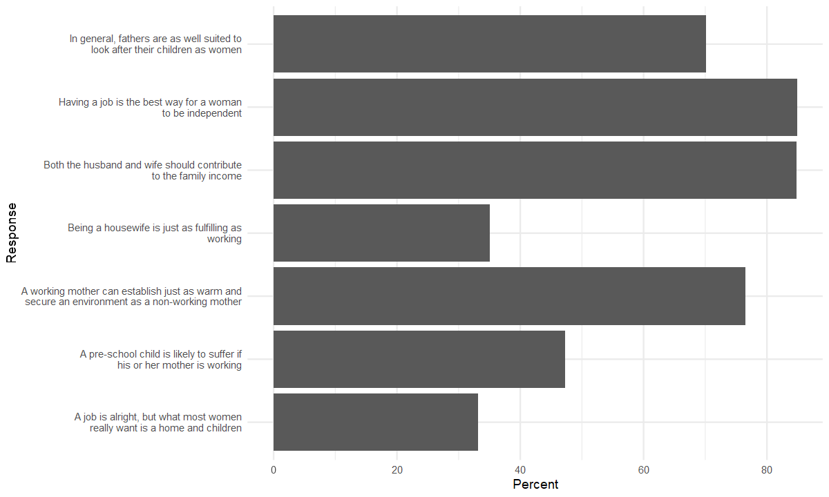
#reorder the response
library(forcats)

gender_role <- gender_role %>%
    mutate(Response = fct_reorder(Response, Resno, .desc=T))
#It seems easy because there is no new components compared to the plot in 6.1.1
# Setting width and height
options(repr.plot.width=10, repr.plot.height=6)#Now START!!!
bar_mulres <-
ggplot(gender_role, aes(x=Percent, y=Response)) +
#geom_bar with stat identity or geom_col
geom_col(fill="black") +
#zebra background (book's author favorite, I guessed)
annotate("rect", xmin=seq(0,80,20), xmax=seq(20,100,20),
ymin = 0.25, ymax = +7.75, fill=rep(c("#e8f7fc", "#def5fc"), length.out = 5), alpha=0.8) +
#hightlighed bar
geom_col(aes(fill=ifelse(Resno == 5, "HL_bar", "NM_bar")), show.legend = F) +
scale_fill_manual(values=c("HL_bar"="#ff00d2","NM_bar"="NA")) +
#average line at 50%
geom_segment(aes(x=50, y=0, xend=50, yend=+8.25), color="#6ca6cd", linewidth=0.5) +
#add percent into bar, using annotate is not efficient so I used geom_text
geom_text(aes(x=10, label=Percent, color=ifelse(Resno == 5, "HL", "NM")), show.legend = F) +
scale_color_manual(values=c("HL" = "white", "NM" = "black")) +
#add annotates
annotate("text", x=48, y=8, label="Majority", size=2.5, fontface="italic", hjust=1) +
annotate("text", x=52, y=8, label = "50%", size=2.5, hjust=0) +
annotate("text", x=100, y=8, label="all values in percent", size=2.5, hjust=1, fontface="italic") +
#edit the shown label in x-axis
scale_x_continuous(breaks = seq(0, 100, 20)) +
#editing the labels
labs(x=NULL, y=NULL,
title="It is often said that attitudes towards gender roles are changing",
subtitle="Agree strongly / agree",
caption="Source: European Values Study 2008 Germany, ZA4753. www.gesis.org. Design: Stefan Fichtel, ixtract") +
#finally change theme
theme(axis.text.y = element_text(face = ifelse(gender_role$Resno == 3, "bold", "plain")),
panel.grid.major = element_blank(),
panel.grid.minor = element_blank(),
plot.caption = element_text(face="italic"),
plot.title.position = "plot",
)
bar_mulres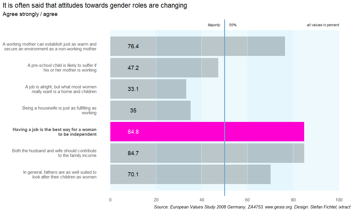
#Finally, we change the font

library(extrafont)
Registering fonts with R#Find a way to setting font family of geom_text to Lato
theme_set(theme_minimal(base_family = "Lato Light"))
bar_mulres +
theme(plot.title = element_text(family="Lato Black"))
ggsave("6.1.2 Bar Chart Multi Res.svg", last_plot(), device=svg, width = 20, height = 12, units="cm")Final result

Bonus part
TIL1: How to control the custom scale_color_manual if we have multiple aesthetic color in different layers
#My pop-up question about using scale_color_manual for different layers with different mapping
#The key idea is using the same "name" and labels if we want to combine them
#https://stackoverflow.com/questions/12410908/combine-legends-for-color-and-shape-into-a-single-legend

#Case 1: If we want the classification has the same color, both in layer text and point
ggplot(gender_role, aes(x=Percent, y=Response)) +
    geom_text(aes(x=10, label=Percent, color=ifelse(Resno == 5, "HL", "NM")), show.legend = F) +
    geom_point(aes(color=ifelse(Resno == 2, "HL", "NM")), size=5, show.legend = F) +
    scale_color_manual(values=c("HL" = "darkblue", "NM" = "red"))
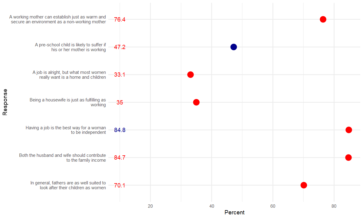
#Case 2: If we want the classification has the different color of "highlight" only in layer geom_point
#The normal element has the same color in both layers

ggplot(gender_role, aes(x=Percent, y=Response)) +
    geom_text(aes(x=10, label=Percent, color=ifelse(Resno == 5, "HL", "NM")), show.legend = F) +
    geom_point(aes(color=ifelse(Resno == 2, "HL2", "NM")), size=5, show.legend = F) +
    scale_color_manual(values=c("HL" = "darkblue", "NM" = "red", "HL2" = "green"))
TIL2: adjusting the position of title to the left of plot, not panel.
Because there are many case that the label of y-axis is very long text and it make the plot title look disproportionate.
plot.title.position, plot.caption.position

Alignment of the plot title/subtitle and caption. The setting for plot.title.position applies to both the title and the subtitle. A value of "panel" (the default) means that titles and/or caption are aligned to the plot panels. A value of "plot" means that titles and/or caption are aligned to the entire plot (minus any space for margins and plot tag).